
Matthew Leitch, educator, consultant, researcher
Real Economics and sustainability
Psychology and science generally
OTHER MATERIALWorking In Uncertainty
A better way to make and show risk ratings: Risk Meters
by Matthew Leitch, first published 6 June 2006.
Contents |
Overview
What are Risk Meters?
Risk Meters are a simple way to capture and display rough, subjective risk assessments. The technique is based on cumulative probability distributions, the conventional mathematical approach to describing ‘risks’ of the kind often encountered by people at work. To this is added some simple and compact graphics to allow many risk levels (i.e. distributions) to be displayed on one screen or sheet of paper.
Risk Meters are an idea rather than one specific design, and in fact different applications of Risk Meters require slightly different designs. No special software is needed to produce Risk Meters; all the examples in this article were done using a common spreadsheet program.
Although the idea is simple you may find you produce better designs more quickly if you engage me for some individual technical tutoring or teletutoring sessions. These can be focused on the particular applications you have in mind, so the end result of the sessions could easily be a usable design, ready go roll.
Where are they useful?
Risk Meters are worth considering if you have to make subjective ratings of something but currently don't do anything to show your uncertainty, or if you already try to capture risk but do so using separate ratings of likelihood and impact. Here are some obvious examples:
Rating ‘risks’ for audit purposes.
Rating ‘risks’ on a risk register.
Rating candidates for a job, recognising that the evidence from interviews and resumes is unreliable.
Showing when each of a set of similar projects is likely to finish.
Showing the chances of each of a set of expenditure accounts going over budget.
Rating the potential of new product ideas.
Rating potential fraud risks.
If you have ‘risks’ or uncertainties that are currently rated using separate ratings of probability (a.k.a. likelihood or frequency) and of impact then you should definitely stop using that approach and switch to a Risk Meter design.
Why are Risk Meters useful?
Presenting judgements as exact and certain is misleading when they are not exact and not certain, which is often the case. We need an easy way to capture our subjective views about uncertainties, perhaps before making an investment in better information. Risk Meters enable us to do that. If we don't we could find that we don't do enough to get better information, or to manage risk we are aware of.
Compared to the method often used in project management and in some non-scientific corporate risk management methods, which is to make separate ratings of probability and impact, Risk Meters are easier to understand, more informative, and – unlike the Probability × Impact style – do not force people to make ratings that do not agree with their real views. In contrast, the Probability × Impact style systematically understates risk, is confusing despite its apparent simplicity, and can produce ratings that imply rankings the raters would think are wrong.
What is the status of the Risk Meters idea at present?
The mathematical idea on which Risk Meters are based is long established. The idea of eliciting a probability distribution by asking questions about cumulative probabilities is also a well established one, usually done to get distributions from experts in scientific or policy matters. The Risk Meter graphics are relatively new.
What is the potential for Risk Meters?
Risk Meters can match even the apparent simplicity of other risk rating methods, but give more information with less distortion than the Probability × Impact alternative. This means that Risk Meters have the potential to completely displace the Probability × Impact style in all the places it is often used.
Furthermore, since Risk Meters are so informative and easy to do they can be used in countless everyday situations where we wouldn't ordinarily attempt to show any uncertainty but should do. Risk Meters could catch on.
Next steps?
The next step for the Risk Meters idea is to grow and learn. Each new application of Risk Meters brings new innovations and refinements, and produces new information about the value and limitations of Risk Meters. Carefully observed trials of the Risk Meter idea can help produce the evidence needed.
Risk Meters in more detail
An example to introduce Risk Meters
Let's imagine you are an internal auditor trying to evaluate the risk of incorrect billing in a large utility company. You have some evidence, a bit of gut feeling, but nothing definitive yet, so you decide to do something rough and subjective. How could you express the risk levels?
One option is to pick a number that is your best guess as to the level of billing error (e.g. ‘5.5%’). The trouble is, you don't really know what the number should be and giving a number makes it look as if you know more than you do. (A similar thing happens when we interview someone for a job and then rate their suitability. How certain can we be on the basis of an interview? Research has shown the depressingly poor reliability of interviews. It's guesswork, but still we just select a grade as if we know.)
A more sophisticated approach is to think about probability as well as billing error level. One way to do this is to make two ratings, one for the likelihood of billing error, and another for the impact of error if it occurs. Often the ratings just use a scale like High/Medium/Low.
The trouble this time is that the billing error level could be any of those. Just picking one, such as Medium, excludes from consideration the very real possibility that the level is only Low, or that it is High. (As it happens large utility companies raise so many bills that they nearly always have at least one error during a year, so the likelihood of at least some error is near to certainty! Therefore, in this particular example, the probability rating doesn't help at all.)
These probability and impact ratings systematically understate uncertainty because they exclude from consideration some levels of impact. If you have chosen one level of impact for a ‘risk’ then the others are no longer considered. A real example of this appears later in this article.
What we really need is a way to say how likely we think each different level of error is. This is a well established idea and amounts to capturing the risk's probability distribution over impact. Risk Meters are simply this traditional idea with some simple, compact graphics to make it easier to show lots of risk levels together.
To rate the billing error risk all we need do is choose a few fixed levels of impact and then put a number on our certainty of the actual error being more than each of those levels. For example, using levels zero, 0.1%, and 1% would give quite an informative analysis of our views about the risk of billing errors. We need to say how likely we think it is that the actual level is more than zero, more than 0.1%, and more than 1%. This is something most people find quite easy to understand and to do, once they have got over the usual worries about making subjective ratings of any kind.
Applied to several different billing streams the resulting risk meter might look something like this:
| Risk | >0% | >0.1% | >1% |
| Billing error – London | 0.85 | 0.10 | 0.01 |
| Billing error – South East | 0.75 | 0.10 | 0.01 |
| Billing error – South West | 0.75 | 0.20 | 0.05 |
| Billing error – Midlands | 1.00 | 0.55 | 0.10 |
| Billing error – Wales | 0.45 | 0.01 | 0.001 |
Risk levels that have higher likelihoods of impacts greater than the higher levels will have longer bars of the redder, more alarming colours. So, when you look down a column of several risk levels the more serious ones stick out further to the right. In the example above the Midlands billing is poor and the best billing accuracy is for Wales.
Notice that green is not used at all. If a risk distribution has low likelihood of being worse than some very low level this is not to say that everything is fine. It is just not as bad as other risk distributions, so it should have less alarming shades of yellow rather than green. However, green can be used when your risk distribution has an upside as well as a downside and you want to show that too.
For example, suppose the risk distributions in question are the sales figures next month for some new products. We could decide that we will measure risk levels compared to the budget. Sales below budget are the downside, while sales above budget are the upside. The risk meter might look like this:
| Risk | < -10% | < -5% | < 0% | > 0% | > +5% | > +10% |
| Sales of brand X | 0.15 | 0.35 | 0.65 | 0.35 | 0.15 | 0.05 |
| Sales of brand Y | 0.05 | 0.10 | 0.25 | 0.75 | 0.60 | 0.25 |
| Sales of brand Z | 0.001 | 0.05 | 0.45 | 0.55 | 0.05 | 0.01 |
Design variations
Risk Meters can be designed in lots of different ways to suit different situations. For example, the choice of colours, levels of impact, number of levels, and orientation can be varied as well as whether you show upsides as well as, or instead of, downsides.
Another design element that is often useful is to show separately the amount of evidence that supports the ratings made.
Here are some examples, some from real cases in major companies where I have done work, to show some of the ways that Risk Meters can be done.
Example #1: Monitoring internal controls projects
This first design is a mock up done for a financial services company in the UK which was working to produce internal controls documentation across each of 24 departments. At the time they weren't sure what standard of documentation each department already had and, as usual, there were doubts over commitment, resources, and skills. The design uses two sets of Risk Meters. The columns on the left are all about the standard of documentation thought to exist for each department initially. Also, the "Evid" column is for a rating of how much evidence supports the ratings: G = guesswork, K = some knowledge, and S = solid evidence.
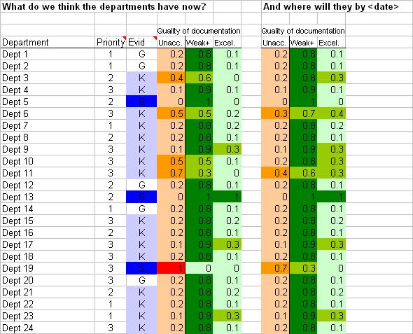
Columns 4, 5, and 6 are for the initial Risk Meter and show the judged likelihood that the documentation is currently Unacceptable, Weak-or-better, or Excellent. Shades of green are used for Weak-or-better onwards because these are acceptable standards. Unacceptable is in shades of red and orange. Looking at the display it seems we know for a fact that Department 19 has unacceptable documentation at the moment but Department 13 has Excellent documentation while Department 5 has Weak documentation. On the basis of some evidence, we think most of the other departments have at leave a 50% chance of having acceptable documentation but Department 11 is a particular concern, even though we do not have solid evidence that there is a problem.
Looking ahead, our other Risk Meter is in columns 8, 9, and 10 and is for the standard of documentation at some date in the future, probably a milestone or deadline. Departments 6, 11, and 19 are our concerns, and you can see that people in Department 5 have decided that having Weak documentation is good enough and they don't want to do any more.
Another perspective on these same projects is to consider why the departments are struggling. The next picture shows a possible way of doing that.
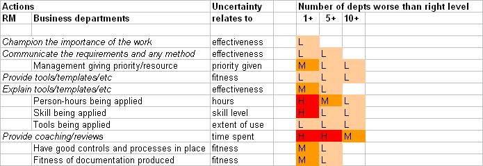
The first two columns list stages in the work. The stages starting in column 1 are those to be done by the Risk Manager. The stages in column 2 are those to be done by the business departments. The stages are arranged in roughly chronological order and in such a way that the actions taken by the business departments are in part responses to the actions by the Risk Manager.
The Risk Meter is in columns 5 – 7 and shows the likelihood (this time just High, Medium, or Low but it would have been better as numbers) of at least one department underperforming, at least 5 underperforming, or at least 10 underperforming at each stage. The ratings in this mock up suggest some concern about the resources applied and their skills, with a resulting risk of spending much longer than anticipated doing quality reviews and giving coaching.
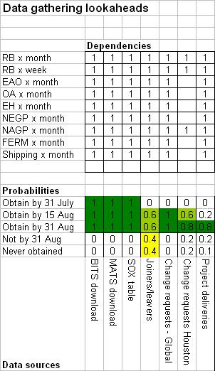
Example #2: Monitoring data collection
This example is as used in a data analysis project for a major energy company, but with the real data removed. The background is rather complex but, in summary, data was being sought from various sources, and on the basis of rather uncertain information we thought it possible that various alternative tables for multivariate statistical analysis could be built from it.
Risk Meters were used twice. The first time it was simply to show the risk of delayed delivery of data. The second time it was to show the likely size of the tables that could be built from the data sources if obtained. The picture below shows only a small fragment of the whole spreadsheet and just shows the first use, to show possible delivery dates of the data. The data source names are at the bottom, on their sides, with the Risk Meter being just above. Clearly there was doubt over getting joiners/leavers data at that time.
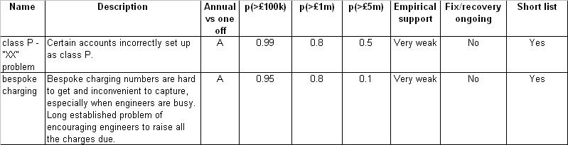
Example #3: Deciding where to look for billing errors
The next example shows only the Risk Meter style of question and lacks the graphics. This is in fact from an early project with a leading telecoms company and at that time the graphics had not been devised. Nevertheless it was good to find that people had no difficulty understanding the judgements they were being asked to make, or responding to the information when presented.
The project aimed to find past billing errors and began with collecting ideas from experts as to possible and known problems that might be worth looking into. The experts were asked to quantify the problems and of course this was partly guesswork in all cases. The ratings they had to give were for the probability of the annual loss being over �100k, over �1m, and over �5m.
Again, this is only a small fragment of a larger design and the actual data has been changed for confidentiality reasons.
Why you should change from the Probability × Impact style
Today a common non-scientific style for making rough, subjective risk ratings is to make a separate rating of probability of occurrence, and another for impact on occurrence. This is particularly common in internal audit, low level safety work, and public sector project risk management. In contrast, people who study risk quantitively very rarely use this style and know it to be deeply flawed.
If in your organisation this kind of rating is used anywhere then you should change it as soon as possible to something that makes more sense.
The apparent simplicity of the Probability × Impact method is probably the result of a misunderstanding I call the Single Risk Fallacy. This is the belief that a ‘risk’ – usually a row on a risk register – is one risk item with a probability and a single, known level of impact if it should occur. Flick through almost any real life risk register and you will see that all the items are really sets of these atomic ‘risks’ and also that the impact is uncertain. For example, one ‘risk’ I read was ‘We lose market share.’ How do you rate the impact of that? Obviously it depends on how much market share is lost. Each different level of loss represents another atomic ‘risk’ with its own probability and impact. Virtually all risk register items are like this and it is not possible to avoid using sets of ‘risks’.
So, in theory, the Probability × Impact approach is not appropriate. What about practical implications?
Systematic understatement of risk and uncertainty
The most worrying practical implication of using the Probability × Impact approach is the systematic understatement of risk levels that it causes. When everything is High, Medium, or Low it is hard to appreciate fully what is going on so here is a numerical illustration based on a real case, where the initial gradings were replaced with probabilities and money figures and the cumulative impact of many risk register items was combined.
The case is the Holyrood Building Project, which designed and built the new Scottish Parliament buildings at a cost more than ten times that originally budgeted. The project was so embarrassing that a public enquiry was held and many documents have come into the public domain, including the risk registers.
After the project had been underway for some years (looking at designs and so on) a company was appointed as construction managers and they asked that the risk registers be quantified. Until then they had been done using the Probability × Impact style in terms of High, Medium, Low. This was done by substituting numbers for probability and impact but the Probability × Impact style was retained. They multiplied the probability of occurrence by the estimated financial impact if the risk occurred, added these up across all the risks, and called it ‘nominal risk’. At the time nominal risk stood at �51.5m.
But hold on. The ‘risks’ were rather general things like ‘Architect originated changes’ so how did they know the exact impact of each? They didn't of course. To explore the implications of pretending they did know impact exactly I reconstructed the risk register but this time put in probability distributions over impact as should have been done at the time. Nobody knows exactly what these should have been, but my guesses seem reasonable.
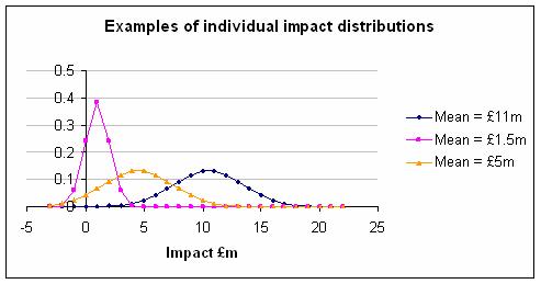
Here are three examples, taking the mean as that given in the original risk register and then guessing a reasonable looking normal distribution. Imagine yourself at the start of an ambitious building project using a cutting edge architect instructed to create a building that would make the nation proud. Could you have been any more precise at that time? I doubt it.
Next, I used Monte Carlo simulation to combine the ‘risks’. The result you get depends on how correlated the individual ‘risks’ are and lacking any information about this I have done the simulation with various different levels of correlation. The first graph below shows what happens when you use the Probability × Impact style, where in effect you pretend the impact of each ‘risk’ can only be at one level. The second graph shows what happens if you use a proper distribution for impact. The difference is dramatic regardless of the level of correlation.
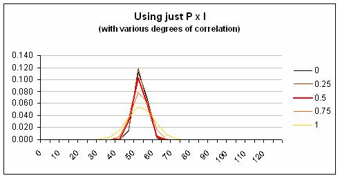
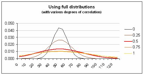
Clearly the risk involved is understated by the Probability × Impact style, which fails to mention the possibility of higher and lower impact levels. (In the Holyrood project this was only one of many fundamental risk management failings and even the improved method of quantification does not encompass the staggering overrun that actually occurred.)
The understatement caused by the Probability × Impact style is a particular problem for people like business continuity managers, whose work focuses on the more extreme impact levels.
User confusion
Two other practical problems with the Probability × Impact style are how it makes people feel, and the often huge difference between what people should be thinking about in theory and how they actually think when asked to make ratings.
Most people asked to give ratings of probability and impact do so without complaining. However, that doesn't mean they are sure what the questions mean or understand correctly what they are supposed to consider.
For example, suppose we have a risk workshop with ten people in it, led by a consultant perhaps, and they are doing risk ratings. The next ‘risk’ is ‘Fire at our warehouse in the next year.’ They are asked to give the probability of fire at the warehouse in the next year and after brief discussion agree that it is Low. They are asked to give the impact if a fire did occur at the warehouse in the next year and decide that it would be High. So, what type of fire did they have in mind when thinking about the probability?
In theory, when they answered the question about probabilities they should have had all types of fire in mind, from the smallest to the largest. And when they answered the question about impact they should have been giving the probability weighted average impact of fires of all severities that might happen, assuming at least one at some severity occurs.
I think that most people respond to these questions at first with confusion and then hit on a simple strategy. They put in mind the image of a fire that they can think of most easily and then ask themselves about its most likely impact. They judge probability by thinking how likely that imaginary fire seems compared with other imaginary events they have been asked to consider during the session.
The warehouse fire I personally think of most easily is a dramatic one – the sort of thing you might see on the TV news – which is a roaring blaze, destroying stock and buildings as firemen battle through the night in a hopeless bid to contain it. Other possible fires are not considered at all.
Faced with a risk called something like ‘Health and Safety’ (I quote from a real example) the user's pain is intensified. What on earth are you supposed to think of under this heading? A risk like ‘Loss of market share’ (again I quote) makes the problem painfully obvious when you are asked to consider the impact. How much loss are we talking about?
Writing narrower, clearer ‘risks’ does not solve the problem. It is not possible to write a risk register with a finite number of atomic ‘risks’ on it, each of which has a certain impact.
Bizarre rankings
Another strange effect of the Probability × Impact style is that it can lead to risks being ranked in ways that raters would not agree with. Here's the problem.
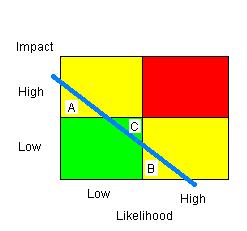
This is the usual box, in its simplest, two-by-two form, that is supposed to combine Probability and Impact into a single grading of a risk, indicated by the colour of the regions, Green, Yellow, and Red. The blue line is any line representing equal riskiness, so risks to the top right of it are greater than risks to the bottom left of it.
Consider the risks A, B, and C shown on the diagram. Obviously C is more risky than either A or B because of where it falls relative to the line of equal riskiness, but C will be classified as Green, while A and B are Yellow. This is the wrong way around. It happens because the edges of the boxes never match any line of equal riskiness; they are too jagged.
What others have said about Probability × Impact
The world of risk management divides into those who see Probability × Impact as too flawed to bother with and those who think it a great technique proven in practice and endorsed by long established standards. However, surprisingly little seems to have been written to debate the matter.
Ali Samad-Khan, president of OpRisk Advisory, has attacked it repeatedly and in very strong terms. For example in ‘Why COSO is flawed’ he wrote: ‘Fundamentally, COSO is inappropriate for use in operational risk management because the definition of risk used under this approach is wholly inconsistent with the definition of risk used in the risk management industry and by the BIS.’ He means by this the Probability × Impact definition of risk, so what he is saying is that of all the faults in COSO's ERM framework, the worst is its promotion of Probability × Impact matrices. In fact it doesn't exactly define risk in this way. However, it doesn't rule out the technique and in the second volume it gives an example of the dreaded matrices in action – a clear endorsement of something that COSO should be helping to stamp out.
Some other experts exasperated by the persistence of Probability × Impact in the face of logic and good sense are Chris Chapman and Stephen Ward. In their fascinating book ‘Managing Project Risk and Uncertainty: a constructively simple approach to decision making’ they suggest a slightly different approach called Probability Impact Pictures. They write: ‘The authors hope that [PIPs] in the context of minimalist approaches will help to end the use of conventional Probability Impact Matrix approaches, illustrating the inherent and fatal flaws in these approaches from a somewhat different angle...’ Usually people are diplomatic in their criticism of the matrices but after warming to their topic Chapman and Ward continue ‘PIM approaches hide more than they reveal. They are a dangerous waste of time.’ It seems they have been working for some time to rid the world of this menace as revealed in this comment: ‘The minimalist approach also departs from the qualitative probability impact matrix (PIM) approach, which is widely used in project management and safety analysis. It was in fact developed to stamp out such approaches, when an earlier attempt using a simple scenario approach failed to achieve this end.’ A fitting summary is their statement that ‘Eliminating the use of PIMs is an important objective.’
Mathematically oriented readers may be interested in ‘Some Limitations of Qualitative Risk Rating Systems’ (Risk Analysis, Vol. 25, No. 3, 2005) by Tony Cox, Djangir Babayev, and William Huber. They write that ‘In general, in a hierarchical risk rating system satisfying unanimity, no such consistent quantitative interpretation of qualitative labels is possible. The reason is that products of quantitative probabilities that belong to the lowest extreme of the “medium” range, for example, should not receive the same qualitative value as the product of probabilities at the upper extreme of the “medium” range, and similarly for other ranges.’ In other words, they are talking about the bizarre rankings problem I mentioned earlier.
Why you should capture risk/uncertainty in subjective ratings
One of those human weaknesses that we all should know about is our tendency to view the future as if wearing mental blinkers. We go through life frequently surprised and yet rarely learn to be more open minded. We tend to think we have more control over things than is really the case, and that in part explains our overconfident predictions for the future.
One aid to curing ourselves of this is to remind ourselves continually of the uncertainties we face. Capturing our uncertainties in a Risk Meter is one way to do that. Here's an example based on real life that illustrates the tendency to ignore uncertainty and the wonderful things that can happen when you don't.
Imagine you are running a project in a large telephone company to find past billing errors, try to stop them happening, and even bill customers for services that have been missed off their bills in the past. You hold a meeting and people suggest areas to look at based on things they know about problems that do or might exist. Your difficulty is that doing the work needed to find specific errors, validate them, and work out what to do about them is expensive. You don't want to waste money chasing trivial types of error. How do you choose which to go after?
Now let's imagine that you do what most people do in this situation. You ask people in your meeting to put a money figure on how much is being lost due to each problem. Of course in most cases people don't know. Some of the estimates seem rather high to you while some seem strangely low. Perhaps the high estimates are by people who are trying to draw attention to a problem they personally are committed to solving for some reason. Perhaps the low estimates are by people who know their evidence is thin and don't want to be responsible for a wild goose chase. Who can say when all estimates are presented as if facts?
If instead you use Risk Meters then the conversation naturally revolves around uncertainty and evidence. You can press people for their evidence without also depressing their estimates artificially.
Another difference brought about by Risk Meters is the ability to see ways forward when things otherwise would seem to be stuck. Suppose that you are still trying to get best guess figures from people and after some debate you end up with a list of 40 possible error types, all of which have an estimated value that is too small to go after. The best guess is a lowish number. (Please just assume this is the case; it may seem unlikely but this is based on reality so it could happen again.) At this point it looks like the project is over.
But it is not. Now try estimating the values using Risk Meters or something similar. Each of those 40 error types has a most likely value, but there is also a chance that the actual value would turn out to be higher, or perhaps lower. Indeed it is likely that in amongst those 40 is a handful that will turn out to have a much higher value than the best guess while many others will have no value at all.
With this insight you can think again about the project. Don't try to pick out at the start the few that are worthwhile. Instead, look for ways to cheaply gather evidence as to the real value of each error type (e.g. by studying samples). Be like a fisherman, trawling for the error types with high value that lie hidden among all the others.
Notice how making our uncertainties more visible opens up new strategies. It reveals ways forward when perhaps we seemed to be stuck.
This billing error example is not a special case. The same would apply to tax collectors looking for tax dodgers, marketers looking for the next big product, record producers looking for the next big hit, girls at a party trying to decide which boys to flirt with, business people looking for apprentices, and so on and on. In each case, if we make a choice based on best guesses alone we tend to be too conservative, do too little to get information that will help us make a better choice later on, and end up missing out on the big winners.
Other alternative techniques
Risk Meters are not the only alternative to the Probability × Impact style. Here are two others.
Non-cumulative probability distributions
In Risk Meters a person's views are shown as a colour coded, simplified cumulative probability distribution, but with many risk distributions it is possible to show the probability distribution in a non-cumulative form. Sometimes this is more intuitive. For example, suppose we think that fire damage in the next year is distributed as follows: 0 – �1,000 = 85% likely, �1,001 – �10,000 = 10% likely, �10,001 – �100,000 = 5% likely. This can be turned into a sort of bar chart that shows the distribution we have in mind, or a theoretical curve can be fitted to these judgements, or indeed we can use different colours to show the likelihood for each range of impact.
Triangular distributions
One way to do a non-cumulative probability distribution is to use a triangular distribution for everything. To do this you have to make four judgements for each risk: (1) probability that the impact is not zero, (2) lowest level of impact you think possible, (3) the level of impact you think is the expected level assuming some impact has occurred (where expected means ‘probability weighted average’), and (4) the highest level of impact you think is possible.
Making everything triangular is crude but it is far better than ignoring the range of impacts altogether. Monte Carlo simulation can very quickly combine the individual distributions to give you a view of their combined impact.
Michael Mainelli of Z/Yen calls this style by the appropriate name ‘BET’, which stands for Bottom-Expected-Top.
Final words
Risk Meters are a quick, easy way to capture subjective views about things that are uncertain, and to keep that uncertainty in view. They are compact and colourful, easy to understand, and quick to produce. They can be applied in many situations and should always be preferred to the feeble Probability × Impact style.
If you are interested, try some out yourself and ask friends and colleagues to have a go. Don't forget to consider some individual technical tutoring if you are really serious.
Appendix: Colour scale formulae
One thing that can be helpful is to have a clear idea of how to map probability numbers to colours. Here are formulae that give you a colour, specified in RGB format, for any given probability. This mapping is suitable everyday risks, but not for scales where very small probabilities can be very important, such as the risk of an accident at a nuclear power station.
|
First, for downside shades:
|
Second, for upside shades:
|
Made in England