
Matthew Leitch, educator, consultant, researcher
Real Economics and sustainability
Psychology and science generally
OTHER MATERIALWorking In Uncertainty
Design ideas for Beyond Budgeting management information reports
by Matthew Leitch, first published 15 July 2003.
The freedom to do more than report variances against targets
If you prepare or use management information reports, whether or not you have decided to go ‘Beyond Budgeting’ (www.bbrt.org), this page will be of interest. One of the first, and easiest steps towards better performance management is to start presenting the management information you have in a more interesting and useful format than analysis of variances against targets. You can add extra pages even if you don't have permission to ditch budgetary control, and the benefits could far outweigh the effort needed.
Typically, you don't need a new computer system, or complicated mathematics, to do much more with the figures you have. In this paper I'll present a number of ideas, guidelines, and examples to show what is possible. I don't have a complete or definitive answer, but there are lots of ideas here to fire your imagination. If you'd like to have a go at redesigning your packs yourself, pump your brain full of these and any other ideas you can find and then have a go.
This paper suggests ways to design management reports that are clear, beautiful, and useful. It applies the work of the following people, among others:
John W Tukey, the inventor of Exploratory Data Analysis.
Edward R Tufte, author of ‘The Visual Display of Quantitive Information’ and easily the leader in this field today.
Herbert A Simon, the Nobel Prize winning economist and psychologist behind the paper ‘Why a diagram is (sometimes) worth ten thousand words’.
Sir Ernest Gowers, author of ‘The Complete Plain Words’ and numerous other proponents of Plain English.
Countless psychologists and ergonomists who have experimented to find out what communicates most effectively. Many of their discoveries contradict popular wisdom.
Although most of this material has been used in science and education this is the first time all this has been applied in this way to the design of management information reports.
The results can be astonishing and delightful. The cumulative impact of many small refinements can easily be a total transformation in just a few hours of work, using data already available.
As well as explaining principles there are numerous illustrations and mini make-overs.
The enemy
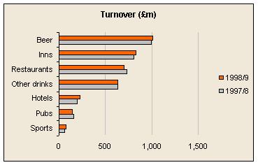
The most common style of management report today is an analysis of variances against targets of some kind. Purely financial reports tend to be some variant on this:
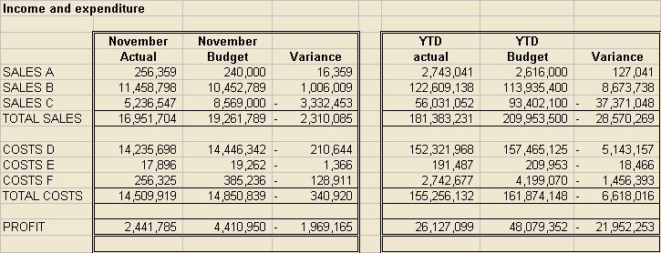
Yours probably looks a bit smarter and has a comparison with last year too. On the other hand, it may have some of the practical problems that can make improved presentation seem very difficult, such as 97 income lines, the last 5 of which are bizarre but necessary adjustments that often result in negative numbers. Under pressure to get everything on one page you may be down to 8pt text already.
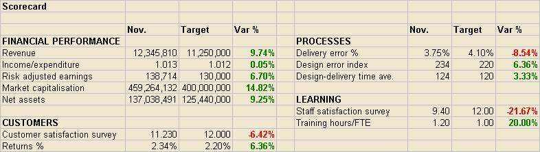
It is more fashionable to have a ‘scorecard’ of some kind showing a variety of financial and non-financial indicators and, as usual, the presentation concentrates on showing whether the numbers are above or below the targets.
If you would like to do better than these please read on.
Design to help readers think
A well designed management information pack will help people think the way they want to and need to. The aim is not to put over some point as clearly as possible, as it would be in a presentation, but to help others explore the information and decide for themselves what the main points are. It helps to have a good understanding of the thought processes that your reports should support.
In budgetary control systems, and other systems of management by fixed target, the typical thinking process involves questions like these:
‘How are we doing against budget/target?’
‘Are we going to beat our target at the year end?’
‘What is the breakdown of this variance?’
‘What has caused the variance?’
‘What can we do to get back on track?’
The typical formats shown in the previous section do a good job of answering the first question, but that's about all. Various ideas have been put forward to answer the second question better. I won't spend any more time on this because in a Beyond Budgeting model this kind of thinking is not used.
Here are some more important questions you might try to help people answer:
‘What is happening?’
‘What might happen next?’
‘How are we doing in absolute terms?’ (relevant to financial resources)
‘How are we doing compared to our competitors?’ (relevant to evaluating how well we are working)
‘How is our forecasting, and how should we change our cause-effect model of our business and its environment?’
‘What might be the consequences of alternative strategies and plans?’
‘What should we think about first?’
One of the best information displays ever invented is the World War II, Battle of Britain Control Room design. You may have seen it on film or at a museum – think of girls in blue-grey uniforms pushing coloured markers across a large map table of southern England, while people sit above at raised benches making telephone calls. Despite this fame, few people realise what a great design it is.
The controller's job was to track enemy formations and scramble RAF fighters to intercept them. The first stage was to follow the enemy course and perhaps try to anticipate their target. This was supported by the map table, with coloured markers moving on it showing enemy strength, location, and direction. Then, the controller would identify squadrons in a position to intercept. This was done from a row of boards on the back wall called the ‘tote’. Each squadron had a column of lights which came on in sequence to show what stage of a sortie the squadron had reached e.g. in the air, refuelling, ready for take off.
Similar resource allocation designs might be relevant in businesses. Marketing spend responding to competitor activity, for example. You would need to design some form of ‘map’ of the competitive landscape, and summarise your resources and their status on some form of ‘tote’.
This is an excellent example of a display designed to support a specific pattern of thinking.
Ways to filter for errors
Before going on to the exciting stuff there's one subject that can't be avoided. Errors. Although you are providing data to people for them to decide for themselves what they make of it, you still have to do some analysis yourself to remove visible errors and get the answers to obvious questions (see later).
The Battle of Britain control room was supplied with information from a Filter Room, where information from Radar stations, the Observation Corps, and other sources was combined and conflicts resolved. I am using the word ‘filter’ in the same sense. It refers to the checks you can make by simply studying the data. There are many other things that people need to do to reduce the risk of poor quality information and these are important too.
Filtering can be done in increasingly sophisticated ways.
Look for breaks in patterns
The simplest approach is to look for things that are different now from in the past and investigate further the ones that don't immediately make sense to you. Look for trends that have a blip.
This is a powerful and simple technique especially when graphs are used, as they should be. However, it does have a weakness, which is that it leads you to look for explanations of the changes you find, and not to look for other information.
Many years ago when I was a young auditor I audited a famous girls' school in England. One of the traditional audit tests was to seek explanations for Profit and Loss items that were significantly different from the previous year. I sat with the Bursar and asked him for explanations, which he was able to give very easily. At one point I asked him why a particular expense had increased during the year and he gave me some convincing reasons, which I noted down. Looking at my schedule for the next variance I realised that I had made a mistake and said ‘I'm sorry, on that last item I should have asked you why the expense had decreased.’ He laughed at me and gave some equally convincing reasons for why it had decreased.
Use expectations
A more sophisticated and reliable approach is to form specific expectations about what numbers you expect, based on a model. It might be the forecasting model. Before looking for differences between the draft actuals and your expectations seek explanations of any major unusual or unexpected things that have happened in the period and update your expectations. If you now have any significant variances it is time to seek explanations, put them into your model, and revise your expectations. Check the variances again, until you are satisfied.
(For a longer discussion of this see the section below on evaluating forecasts.)
Ways to reveal what is happening
Show time series where possible
Some of the most common patterns of thinking to be supported by management information reports are the questions ‘What is going on?’, ‘How have events affected us?’, and ‘Where are we heading?’ These call for showing numbers over a period of time, usually with graphs.
One design I have seen shows monthly figures for the previous several months, the current month in the central column, then monthly forecast figures for the next several months to continue the series.
Without seeing the variations over time it is very difficult to evaluate the importance of a difference between one month and the next, or one month and a forecast. A 10% movement might be an extraordinary event, or less than the usual swing.
Use graphs
The best way to show the value of a number is to state the number, but most of the time what managers want to know is what is going on, for which you need to show trends and comparisons. Graphs are the best way to do that.
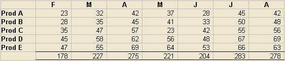
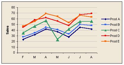
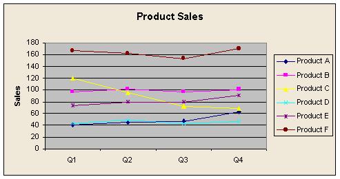
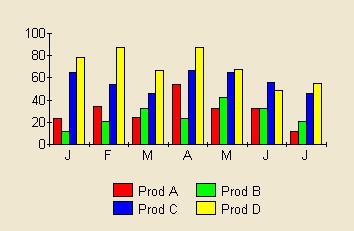
In this example, it is difficult to tell from the table of figures that the product figures tend to move together, that products E and D change places during the period, and that product C in May is completely out of line. On the graph it is obvious.
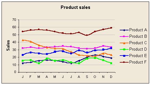
A common problem is that it can be difficult to separate lines when there are several of them close together. A stacked bar chart does this well and, although it is difficult for readers to see trends in components over time, it is easy to see the most important components and spot oddities in particular periods. With a line graph the problem of separating lines can be reduced by stretching the chart vertically, cleaning up the plot area, using thicker lines, changing colours, and smoothing. Sometimes adding more data points helps separate the lines visually, and sometimes it does not.
If you are showing KPIs all of which are on different scales it is possible to get more on one page by using lots of small graphs. In the example below you could probably get about 20 of the small graphs on a page of A4. The larger size shows two numbers plotted on the same graph but using different axes, as you would if you wanted to look for correlations between them.
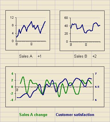
Getting graphs acceptably clear at this size requires attention to detail. Remove plot area borders and colours. Fade the grid lines to the lightest grey. Reduce the scale divisions, and use only the minimum of date information for the x-axis. The legend goes under the graph rather than on it to save space and colour coding can be used as shown. The lines are slightly thicker than the default and strong colours have been selected. In the first two examples the number after the graph title (‘+1’, ‘+2’) represents the change this month against the previous month, effectively giving a little more detail for the most recent figures.
If you are prepared to go without the luxury of a scale on the Y axis you can pack even more into your graphs. Here are 72 data points on a stretched postage stamp. Crucially, each graph is as high as a normal line on a spreadsheet, so this is about the same amount of space as it would take to show the actual, target, and variance for each of the same numbers!
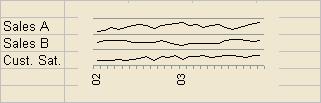
This was done with Excel by scaling each data series so that their maximum and minimum values fell within the same range, say 10 units, then adding 20 to each number in the first series, 10 to each number in the second series, and 0 to each number in the third series. These were then plotted on the same graph, but the scale was set to 0 – 30 and the major divisions (which fix the grey gridlines) were set to 10. That way each graph falls in its own major division.
If you use some ingenuity you can make Excel produce some very interesting graphs. The secret, as in the previous example, is to manipulate the figures before they go into a graph. For example, if you want to show movements of some number (e.g. cash flows in and out) you can do it with a stacked bar chart as in the following example. To read it start at the top left. The first green bar is cash coming in. The next bar down is a tiny green bar for some more cash in, but the next is a pale red bar and represents cash flowing out, and so on.
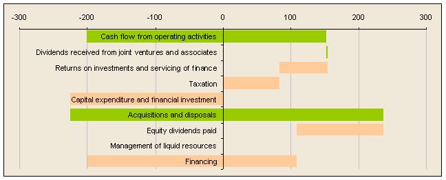
It's not hard to see how to do this if the cash position is always positive, but the logic when it crosses from negative to positive is a bit tortuous. If you can't work it out email me and I'll send you a spreadsheet with formulae!
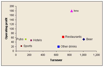
Explore ratios
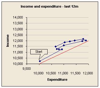
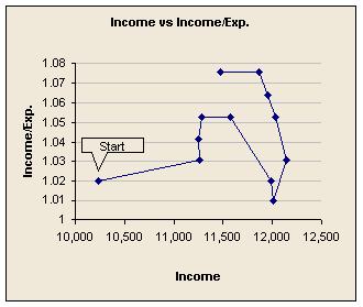
Often, the simplest way to analyse a trend is by using ratios. For example, direct costs may be rising, but what are they as a percentage of revenues? An alternative to showing the ratio itself is to show the two numbers on a scatterplot, with a line connecting consecutive data points. In the first of these examples the red line represents the place where expenditure and income are equal, so this company is on the right side of the red line, and getting better despite a weakening that occurred as turnover grew.
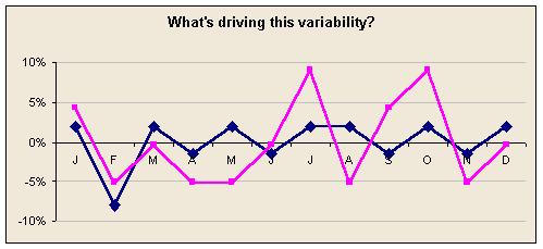
Explore rates of change
Plotting rates of change tends to accentuate trends, though they can look alarming. Sometimes it is rates of change that are driven by business improvements.
Eliminate distortions, fit simple models, and show residuals
One of Tukey's favourite techniques for Exploratory Data Analysis was to study the differences between actual data and simple functional models (e.g. straight line, parabola, exponential). These differences are the ‘residuals’. For example, a trend may be downwards but with a seasonal variation. We can fit a line to the downward trend and add a seasonal pattern based on the last few years. The differences between this simple representation and the actual results are residuals that may reveal some other effect not otherwise obvious.
Some factors that drive results tend to distort the underlying patterns and should be analysed out, adjusted for, or shown as part of the functional model. Inflation, for example, is low in the UK at the moment, but still high enough to distort trends significantly, especially if you are looking at longer term trends.
Another example is the different number of days in the calendar months, ranging from 31 days to 28 days. If the figures vary with the days of the week (e.g. quiet at weekends) then the number of weekends in a month can make a further difference. These can be adjusted to reveal the true trends beneath.
In the above graph the lines show monthly figures for, say, revenue. The blue line is where the value per day is constant through the year. The pink line shows the even more drastic distortion produced when the value is constant per working day (based on UK holidays in 2003).
This can get even more entertaining if a company uses accounting ‘months’ that are whole numbers of weeks. For example, four 13-week quarters, each made up of three ‘months’ of 5, 4, and 4, weeks respectively. Since many bills are received for calendar months and accruals are not always perfect this can cause significant distortions.
Eliminating such distortions is even more important if you want to search for correlations in the data.
Ways to show what might happen in future
In a budgetary control system the reason for making forecasts about the future is to see if you're going to make the budget or not. Beyond Budgeting this is not an issue, so why forecast?
Fortunately, there are much more important reasons for having models (even if they are just mental models) of how your organisation works and for making forecasts:
Ideas about how your organisation and its environment work under-pin your strategies. You decide actions are a good idea when you believe they set in motion a chain of cause and effect that is beneficial. Typically, the better your model the better your strategy.
Forecasting the future helps you prepare for it and influence it. That doesn't mean you have to predict it perfectly and indeed opening your mind to the full range of possible future outcomes is essential.
Typically, forecasts are based in part on what you plan to do, and forecasting models can be used to estimate what would happen if various alternative future plans were followed.
Models/forecasts help you form expectations about the results and other measurements you expect to see, and these can be useful for detecting errors in measurements and unexpected/unreported events that are affecting performance.
Circulating forecasts is a way to allow distributed planning. For example, a sales forecast might be circulated so that people in the supply chain can plan their work.
Often, what works for showing past results clearly also works for showing future results. However, there is one big difference that has to be taken into account: the future is not known for certain.
Show uncertainty explicitly
If you circulate forecasts so that people can do further, detailed planning using them it is dangerous not to show your uncertainty explicitly. ‘What will sales be next month?’ If you give just one number then you are saying that is what sales will be and you have no uncertainty. This invites others to plan as if there is no uncertainty and usually that will be wrong. Show a range. For example, you could show your best guess, a range such that you are 60% sure the future will be within that range, and also a 90% range. Here is such a forecast using a graph.
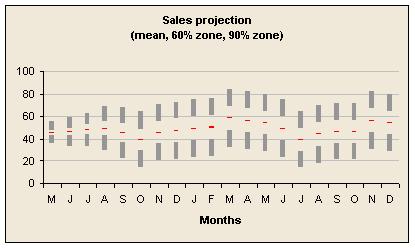
This example is based on a style in Tufte's ‘The Visual Display of Quantitive Information’ and was done using a stacked bar chart. Spreadsheets also allow you to add error bars, which might be adequate depending on circumstances.
Obviously there are lots of ways to decide your range, but that's outside the scope of this discussion.
Forecast repeatedly to explore alternative strategies
When you forecast in order to explore what would happen if you took various alternative actions you naturally make repeated forecasts. These cannot easily be shown in a management information pack and you will probably end up just showing the final forecast once a plan has been selected. However, you may want to show readers something of the process and the decisions taken and not taken, so let's go through the planning process to see how it could be done.
Imagine that at the start you run a forecast with some assumptions about future demand and look at how those translate into results. A crucial question is whether achieving those results could be achieved within the existing capability of your company. Another is whether, in contrast, the demand requires much less capability than you have so that considerable economies might be possible by reducing capability.
So does your forecasting model help you detect such potential future conditions or, better still, the probability of them happening? If not the implications could be disastrous. For example, the forecast may be very pleasing but fail to take into account the fact that you do not have enough warehouse capacity to handle the level of activity.
On the other hand, if your model is smart enough to contain all the constraints needed it may not be smart enough to show you when those constraints affected the forecast outcome. You need to know so you can consider whether to change the constraints, typically by making fixed cost purchases or disposals to change capability in advance, though such investments may be no more than some management time to rethink how things are done.
Better still is a model where such decisions are taken by the model according to policies you can easily alter. The reason is that otherwise you are effectively evaluating the results of a strategy in which ‘now’ is the last opportunity to change the plan significantly. Unless you can model possible future decisions your forecasts will usually be more gloomy than they need to be.
If you make forecasts on the basis of your best guess for key drivers then those forecasts will usually be distorted by constraints. That's because the outcome for best guess driver values is likely to be affected by different constraints to other possible driver values, not recognised in your modeling. This is a typical manifestation of the Flaw of Averages.
For this reason, I will assume that Monte Carlo simulation is being used to model uncertainty explicitly. This means we can talk about the probability of things happening.
What you present in management information packs depends on how much the readers are involved with planning. It may be that they have no involvement but would like to know things like the probability of a new office being opened. At the opposite extreme it may be that you need a live computer model available with convenient switches and scenarios so that plans can be made in the meeting.
Alongside projections and their spreads, consider showing the capability-altering changes assumed or potentially necessary according to the model, and some helpful probabilities, such as the probability of the change being needed or worthwhile.
Show scenarios
One problem with using distributions is that it can be hard to understand how the variation arises. You can explain this and sensitize people to evolving events by showing a small range of very different scenarios. Tell the story of each in words, figures, and pictures.
Look at your commitments
It can help to focus attention appropriately if you show what revenues and expenditures are committed in advance, as it is other revenues and expenditures where the uncertainty and scope for management exists. For example, consider this graph for an organisation that has some committed expenditure, but no committed revenues.
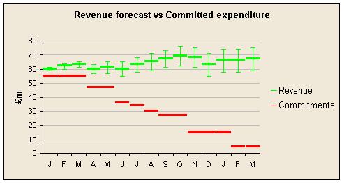
This picture is based on a presentation by Adrian Poffley of Sight Savers International, where budgets were ditched some time ago. This charity provides guaranteed funding for worthwhile projects but to do this, and avoid stop-go funding, they need to manage the uncertainty around their revenues and know how much they can commit. They want to know where they might be if they do what they're planning, and if they could cope.
Ways to evaluate performance
Showing time series provides one of the best sources of performance analysis, which is comparison against past performance. However, there is more that can be done.
Show comparisons against peers
This is one of the basic principles of the Beyond Budgeting model.
Some limitations are that you can only rank on the basis of one measure, and it is difficult to show the position in previous time periods. Here are some designs to help in comparing against peers:
Show results in relation to environmental changes known to drive results
Even if you can't quantify the impact of external factors on your organisation it helps to show them, preferably on the same graph or lined up vertically so the time series can be compared.
Show trends in resources
In the Beyond Budgeting model performance relative to competitors is particularly important, but there is still value in knowing, in absolute terms, how you are doing. For example, in telecoms a few years ago it was possible to be doing well against competitors but still be at the brink of collapse. Also, an entire industry can become obsolete.
These concerns are more to do with resources than with performance, though of course it is performance that changes resources. Therefore, it can be more helpful to show trends in resources over time as this helps people understand where they are and what resources are available to support future actions.
Show comparisons against genuinely fixed needs
Sometimes there are genuinely fixed targets to beat, such as one imposed by a government's regulator. In these rare cases progress relative to these fixed targets needs to be shown.
Ways to evaluate and revise models and forecasts
Just because a model has been tough to create and represents the considered views of people with many years of experience doesn't make it reliable. Models need refinement, and continuous learning is needed to stay up to date.
The models used to develop strategies and those used for forecasting are usually separate and different, though of course it would make sense for the strategy model to be at least part of the forecasting model. In this section bear in mind that the models might be different. Here are some ideas to consider.
Look for correlations including autocorrelations
Business leaders are particularly interested in what causes things to happen and what they can do to cause things to happen. For example, if expenditure on advertising correlates with rate of sales growth that is encouraging. If not it is concerning. If turnover is correlated with earlier movements in national GDP growth then business leaders want to know how much, and when the effect hits. It may be crucial to staffing decisions, for example.
The scatter plot is an easy way to search for patterns, and you can look at a lot of them quickly if you need to. The following example is a ‘draftsman's diagram’ showing three independent variables (I1, I2, and I3) against one dependent variable with no delay (D), a one-period delay (D'), and a two-period delay (D''). Look carefully and you can see that I2 seems to be driving D, but with a one period delay.
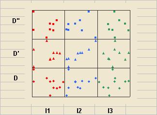
To get so much on one small diagram using Excel I have equalised the spread of the variables and added fixed amounts to put each data series in a box made using the major gridlines. Labels then go on the worksheet behind rather than the graph. It's cheating but worth it.
Actually the link between I2 and D is not so hard to see. In the first of the following examples the lines seem to have a similar shape. The second is a more analytical way of searching for correlations. I've calculated the linear correlation coefficient, calculated from this the ‘t’ statistic, and found the two tailed probability that the apparent correlation is actually the chance result of two normally distributed random variables producing a sample of data that seems to be correlated. Subtracting this from 1 gives the probability that each pair of variables is correlated at least to some extent. (Actually it doesn't as I gave myself 24 chances to find the correlation, so the true probability should be lower.) Then I've plotted all the possible combinations of independent variable and periods of delay.
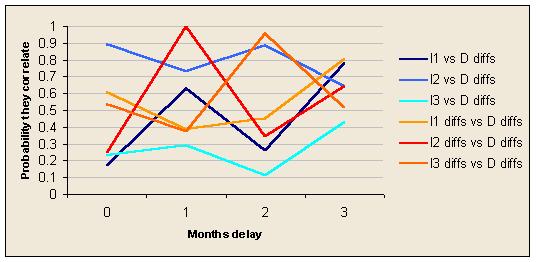
On this occasion the analytics pick out the fact that changes in I2 seem to be linked to changes in D after one period of delay, but there are other unsuspected apparent correlations.
Go Bayesian
Many people (including me) have been taught a style of statistics called ‘hypothesis testing’, which involves trying to calculate the statistical significance of results to see if we should reject the ‘null hypothesis’. In this style there is no conclusion without statistical significance. If you don't have enough data you have to sit on the fence.
Unfortunately, life is not so patient and we often have to take decisions and start actions without having as much data as hypothesis testing statistics require. Shouldn't the data we have be influential, even if they are not conclusive? Also, the hypotheses we really hold are almost never null hypotheses! We think if we can improve customer service we'll lose fewer customers, not that there is no connection between customer service and losing customers.
A better way to approach these problems is using Bayesian statistics. This is not complicated and provides a logical framework for combining evidence of all sorts, from measurements to anecdotes, and adjusting our beliefs from day to day as new evidence comes to light.
First, list a set of mutually exclusive but collectively exhaustive hypotheses. Next, have a view as to how likely you think it is that each is true. (The total should add up to 1.) Then, evaluate new evidence by thinking about the probability of that evidence occurring assuming each hypothesis was true. Revise your view as to the likelihood of each hypothesis being true using the formula: new probability that hypothesis is true = probability of this evidence arising from the hypothesis divided by probability of this evidence arising from any of the hypotheses. Whether you do the calculations or not the point is that each new piece of evidence should change your view, not by causing you to accept or reject some single hypothesis, but by changing your views about the likelihood of all relevant hypotheses.
As each new data point arrives you can revised your views and there is no need to wait for a statistically significant set of data before you start learning.
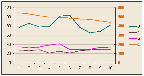
Imagine there are two variables you believe are causally linked. The question is, how strongly? If you can increase one by a certain amount, how much will the other increase? Imagine you start with the view that there is a linear relationship between the variables and that the slope is somewhere between -3 and +3. No other possibility is plausible to you and in fact you have a feeling it is more likely to be a positive slope than a negative one (i.e. the two increase together). In month 1 you record the values of each variable. There's nothing you can do so far but in month 2 you get another pair of values. One variable has moved by a certain amount and the other variable has moved by a different amount. The ratio between these movements is your clue to the gradient you are trying to learn.
Consider the probability of getting such a pair of movements assuming each possible slope value is true (for simplicity assume slopes are -3, -2, -1, 0, +1, +2, and +3). Apply Bayes' theorem and calculate revised probabilities for each slope being the true one. Next month you get another pair of values and repeat the process. Keep going. Here's a graph showing how your beliefs about the slope might change as new data arrives.
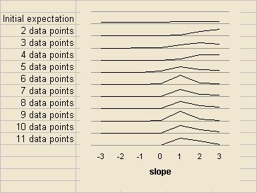
With so few data points to go on your conclusions will be heavily influenced by your initial beliefs, but as the empirical evidence piles up gradually your initial views become less important (except for hypotheses you said were impossible).
Combine knowledge of the world with mathematics
Many mathematical approaches to data analysis assume you know nothing more than the data given but in real life you know, or can find out, much more and this can be very helpful. The Bayesian approach illustrated above is a good choice if you want to combined different forms of evidence.
Knowledge of the world is also important for working out the direction of causal relationships.
Suppose you work for a large business and collect a vast amount of data which shows a strong correlation between two variables. Which causes which? Or are they both driven by some other factor? From the correlation it is hard to tell. But suppose the business sells ice cream and the two variables are the weather and sales of ice cream. Your knowledge of the world tells you that people buying ice cream does not make the sun come out, but the sun sells ice cream.
Your knowledge doesn't always help. Suppose you now work in a bank and gather hundreds of data points over 12 months from all 250 branches. Analysing them shows that branches with happy staff are more likely to be expanding their business and winning new customers. In this case it is not so obvious that good morale is causing more sales. It could be that working in a thriving branch makes people feel happier. It could also be that these banks are in thriving, prosperous regions and this is the reason for the good business results and happy employees.
Don't rely on time series
If you want to examine the relationship between two variables and one data point arrives each month it will take a long time to learn anything reliable. On the other hand, if your organisation can be divided into separate ‘experiments’ you can learn more. If you have 200 branches and each branch is different then you can look for patterns across the branches and, effectively, that means you get 200 data points a month instead of 1. You could also break down into customer account teams, contracts, or any sub-unit that will generate useful data.
It helps if your business model is expressed in terms that makes this possible, e.g. using frequencies. For example, suppose our strategy is based on the hypothesis that quality of service in installing equipment drives purchases of additional equipment. Put like this there seems no alternative but to work out some metric of quality of service and track it over time against overall purchases of additional equipment. But suppose instead our hypothesis was that installation visits considered trouble free by customers lead to more purchases of additional equipment, so the higher the frequency of installations considered trouble free by customers the better. Now it makes sense to look at individual installation visits and the purchases by customers who received those installations. Instead of one data point a month you could have hundreds.
Actively experiment
Unless your knowledge of the world is conclusive it is usually impossible to tell from correlations what the causal relationships are. To find out you need to actively experiment – trying things to different extents to see how the results vary.
Visualise the accuracy of forecasts over their whole lives
Assume you are doing 5 quarter rolling forecasts every quarter. Great. Each quarter you compare the previous quarter with the quarter's actual results and make your new forecast. Next quarter it is your new forecast that is compared with actuals. The implication is that only the first quarter of each forecast is compared to actuals.
Here are two graphs that overcome this. In the first, the actual value for a KPI is shown in red and successive 5 quarter forecasts are shown in increasingly dark colours, ending with the green line which represents the new forecast, as yet untested. The second graph shows the difference between forecasts and actual results after 1, 2, 3, 4, and 5 quarters, for each of those forecasts. Again, the darker the colour the more recent the forecast (which is why some have been tested for fewer than 5 quarters).
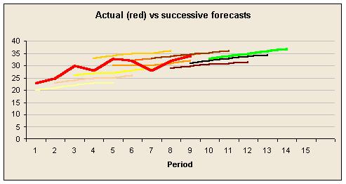
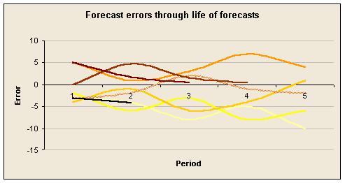
Sadly these forecasts don't seem to be getting better.
Flex your forecasts
Most forecasts are based on projecting a few key numbers into the future, usually based on current information, and then working out other numbers from the projected numbers. Let's call these numbers ‘projected’ and ‘derived’, respectively. For example, having forecast turnover, the model might calculate certain types of expense as percentages of turnover. If the turnover estimate is wrong the expenditure estimates will probably be wrong in part because of this.
The forecasting errors for these derived numbers can be calculated on two alternative bases: (1) actual vs original estimates, and (2) actual vs flexed estimates based on actual figures for projected numbers. Both forecasting errors are of interest. The first because plans may have been based on the original estimate. The second because that is what you can correct by changing the derivation formula.
Consider calculating and showing both types of error. You could show it as the total error analysed into two components: the projection error and the derivation error.
Be open about model flaws
Conventionally, forecasts are done to assess whether the budget or target will be reached at the end of the financial year. If forecasts prove to be wrong pressure is applied to people to provide more accurate forecasts, and they respond by manipulating their performance, and reported performance, to flatter their forecasting skills. None of this is useful or desirable.
The attitude has to be that forecasts are for planning purposes. Also, if the forecast is different from the actuals it is the forecasting model that needs to be revised. If the actuals are disappointing because of the laziness and incompetence of the people given the task of performing then step one is to revise the forecasting model to incorporate laziness and incompetence, and step two is to change the business in some way to see if it is possible to eliminate the laziness and incompetence and revise the forecasting model again.
It may help people to get out of the habit of judging performance on the basis of discrepancies from forecasts if you use a separate page or at least a separate summary and picture to show forecast accuracy.
Ways to focus on important information
Once you dispel the myth that variances from budget signal things you should be paying attention to, the question is ‘What should we focus on and how can I alert readers to these things?’
An item in a management report could be worth highlighting for a number of reasons. Typically it will be because of one or more of the following:
It is unexpected, having been caused by some unexpected (possibly unknown) event, failure to carry out some planned activity, failure of an activity to produce the results expected, performance of an unexpected action, or the unexpected effect of some action.
It is unexpected because of faulty forecasting and/or a faulty cause-effect model of the business.
It is an amount that is large/significant. In a purely financial report it is usual to take the amount of money as the indicator of significance, but in a scorecard it is more difficult to decide what is large.
It is part of a consistent emerging trend.
It is out of line with normal behaviour. A blip.
Visual ways to highlight interesting information include bold text, colours, and tag symbols such as stars. Colour is probably the most effective, but you have to be careful not to use too much of it, or it loses its effect.
Do not assume that your colour codes are self explanatory. One of the most widely used conventions is Red Amber Green. The fact that the analogy with traffic lights is faulty has made no difference to the popularity of this code. Analogies with temperature are also tricky as, in physics, red (usually considered the hottest colour in graphics) is not as hot as yellow, which is not as hot as white, which is not as hot as light blue.
However, showing when something deserves attention is very easy compared to deciding that it does. The preceding sections have discussed various reasons why some number might be important. Here are some additional ideas.
Show actions that were expected to deliver improvements
Perhaps the most interesting causal link is between action and results, yet it is surprising how rarely action taken is shown in close proximity to results. The projected impact and timing of future actions can be shown for forecasts, and the delivery or otherwise of actions can be shown when reporting actual results. Checking actions taken is very important for working out what kind of alert to raise and what sort of action might be appropriate.
Construct a scale of significance
Particularly if you are using a scorecard of measures with different units it can be difficult to decide how large a fluctuation is significant. Percentage movements are not a very good solution, though you might be able to show the movement as a percentage of the normal range for the indicator.
An alternative is to construct a scale of significance by picking a variation on a major indicator and deciding how much variation on each of the other indicators would be of equal importance, all other things being equal. For example, an increase in turnover of �1m might be as significant as a 0.1 increase in the customer satisfaction index, or a 10% reduction in debtor days, and so on.
Use symbols to show the nature of the alert and other attributes to show its priority
For example, you could use letters to represent each reason for an alert, such as F = forecast error, AN = action not taken, T = trend, and B = blip. Bold and colour could be used to show the importance of the alert.
Don't wait to be asked for explanations
In a budgetary control report some of the narrative (sometimes all of it) consists of sentences restating variances and sometimes giving breakdowns of them. e.g. ‘Stationery expenses are �170k adverse to budget due mainly to adverse variances in paper (�23k), paper clips (�12k), and sundries (�121k).’ The narrative is like this because that's the way budgetary control thinks, and because the accountants who have to write the narrative cannot easily find out anything more helpful.
When budgetary control is ditched those questions about variances disappear, but new and more interesting ones are asked instead. For anything that deserves an alert it would be helpful to supply the answer to the obvious questions readers will have in relation to the alert. Indeed, just showing what kind of alert it is will require some investigation.
Often it is unrealistic to expect accountants to do this when it is others who are actually managing the operations. Instead, ask managers to explain the major changes they have made, or failed to make, and the other events that have affected results. This is not a request for explanations to variances and the information can and should be provided in advance of figures being available.
The accountants can then use this intelligence to verify figures and it can be used as the basis for helpful narrative.
General guidelines for clarity and compactness
Many of the examples given so far would not be possible without careful design and attention to detail. The efficiency and beauty of a display are crucial. Here are some general guidelines. Without them it is very difficult to get enough data on the page, clearly enough, to do the job.
Guideline 1: Name numbers accurately without inventing jargon.
Guideline 2: Define numbers.
These two guidelines deal with one of the biggest challenges in management reporting: consistent meaning. Even the most important metrics in many businesses have surprisingly fuzzy meanings and misleading or baffling names in management reports. Some companies employ analysts simply to examine key metrics and make sure they mean what they seem to mean and that everyone has the same understanding and method of calculation for each metric.
Good names and definitions help with this.
Warning signs include the words ‘Net’, ‘Gross’, and ‘Adjusted’; names of computer systems and other acronyms; the same numbers given subtly different names in the same report (suggesting the jargon is out of control); numbers that are the result of reallocating several costs or revenues; and anything else you don't understand easily at first attempt.
Guideline 3: Maximise legibility of text.
The various factors that affect the ease and speed with which text can be read have been studied in numerous experiments. The top choice is usually Times New Roman text at 11pt, in columns about 10cm wide, with normal line spacing, left aligned. A font like Arial or Helv sometimes works better on a computer screen, however.
Guideline 4: Comment and explain in plain English.
Plain English is the best English for most things. It's an art in itself with several excellent books available.
Guideline 5: Choose the right type of graphic or table.
The best choice usually depends on what the reader wants to do with the information. Some designs are just never a good idea.
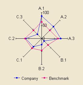
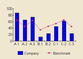
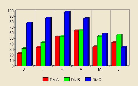
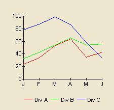
In this example, the spider's web style is hard to read and understand whatever the task. Some believe that the shapes it creates are memorable or meaningful so creating ‘patterns’ that can be recognised. Research has shown that this is not correct and the simple example above should convince you that plain graphs are better.
Despite this, spider's webs are often used in benchmarking and psychometric reports.
Guideline 6: Use colour, but sparingly.
If you use too much colour it is impossible to use colour to highlight something important. It looks tacky too.
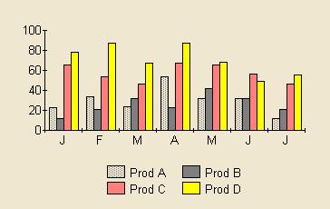
In this example, let's assume Product D is more interesting than the others for some reason. In the first graph all the colours are bright. In the second graph product D is a bright yellow and stands out.
Tufte gives other examples.
Guideline 7: Maximise data density.
Guideline 8: Maximise data:ink ratio.
Guideline 9: Eliminate chart junk.
These guidelines come from Edward R Tufte.
Data density is the amount of data per unit area of the page. Repeated data should only be counted once for this. In some cases data density can be improved by just making the table or graph smaller, but usually there is more to it than that.
Data:ink ratio is the proportion of ink used to show data. Often this can be improved by just removing lines that are not needed. The effect of this simple guideline can be startling.
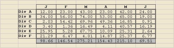
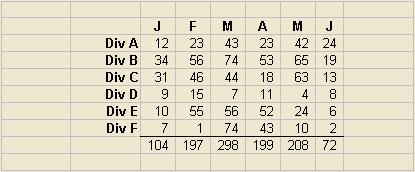
This table was made more compact by removing most of the lines (especially the double lines which create an unpleasant moire effect), dropping the decimal places, changing to a proportionally spaced font, eliminating the shading, and right justifying the row headings, before reducing the column widths.
This graph was shrunk by eliminating the horrible 3D effect (clarifying the graph too), removing unnecessary lines, switching to lines instead of columns, and then reducing overall size to exploit the improved clarity.
Chart junk means jazzed up graphics that use lots of space to show a small amount of data, often in a misleading way. Tufte gives several examples.
Guideline 10: Maximise relative entropy.
Information theory offers some interesting insights into management reporting. For example, the amount of information in a message depends on what the receiver already knows. If you receive a message telling your something unexpected that is more information than one telling you something you already thought likely.
Another application of information theory is the calculation of relative entropy in a financial breakdown. Imagine we have to show a number analysed into parts (e.g. costs on a Profit and Loss account) in a given amount of space and that we have more detailed breakdowns available so that we can do it in various ways. The theory is that if the numbers on our breakdown are about equal in size the information content is likely to be maximised.
Imagine the alternative. Perhaps two huge figures for payroll and materials then lots of space given over to tiny legal and audit costs, bank charges, and office sundries. Clearly it would be better to sweep up the little costs and use the space to break down the big numbers that have most effect on overall results.
Of course if some numbers are more controllable or more variable than others that might suggest a different allocation of space.
Guideline 11: Show as much detail as possible; don't over-summarise.
If you still feel a desire for lots of white space and simple summaries curb those feelings. Ergonomic research shows that people find it easier to move their eyes to find information on one page than use their fingers to turn pages to find it. What we need to do is get as much as possible on each page, but clearly, so the reader's eyes can find their way.
Applied to individual graphs, it helps to keep detail if you can. For example, if showing weekly figures instead of quarterly makes it hard to see long term trends you don't have to summarise the figures into quarters. Try adding a trendline instead so you show both variability and long term movement.
Conclusion
A consistent experience for companies who have gone Beyond Budgeting is that once the budgets have gone they find they think of many more improvements they can make to the way they manage. The same is true for the presentation of management information. The replacement for variance analysis is a huge and fascinating subject with endless scope for improvements.
Efficiency is vital. Question every number's information value compared to alternatives. Every number, graph, and piece of text should be working hard to justify its space on the page.
Almost every design I see shows some new problem or design idea. For example, a company graphed actual monthly EBIT against budget and, separately, actual monthly EBITDA against budget. Both were on bar charts with strong colours for budget and actual. The overall visual impression was of smooth progression, but this was created by the heavy graphics for the budget numbers. Even more odd was the fact that some of the EBITDA numbers were better than the corresponding EBIT, showing that some of the depreciation was the wrong sign! Presumably there had been some large adjustments in certain months. These graphics not only created a false sense of progression, but also covered up some obvious clues that the numbers were not reliable.
As with most creative design challenges, if you want to improve your reports the best thing to do is pump your imagination full of inspiring examples and have a go.
Links and further reading
Related ideas are discussed in my papers ‘A framework for accelerating management systems’ and ‘Learning more from experience.’
Edward R Tufte (pronounced tuff-tee) has a website. In the ‘Ask E.T.’ section he has posted some ideas on graphics for management information here. He publishes his own books to his exacting standards and his best book is ‘The visual display of quantitive information’. Two other outstanding books by Tufte are ‘Envisioning Information’ and ‘Visual Explanations’. The books are beautiful as well as inspiring.
‘Why a Diagram Is (Sometimes) Worth Ten Thousand Words’ was written by Herbert A Simon and Jill H Larkin in 1987 and published in Cognitive Science, 11: 65-99. It also appears in a compendium of Simon's work, ‘Models of thought: volume II’.
Keith R Herrman has written ‘Visualising your business’, which is a compendium of just about every kind of graph you can imagine, applied to business examples.
The Plain English Campaign offers various useful guides on writing clearly.
If you're putting your information on the Internet or an intranet, there is some helpful guidance on clarity at Jakob Nielsen's site, www.useit.com.
A software and consulting company that offers help making your management information clearer is Metapraxis. Their site has many papers on why this is important, though the examples are preoccupied with trying to decide if you will reach budget at the end of the financial year or not.
The National Institute of Standards and Technology (NIST) offers a fantastic site on Exploratory Data Analysis with many examples of graphic techniques.
‘Measuring business performance’ by Andy Neely and published by The Economist Books is a very interesting framework with many real examples from leading organisations.
‘The Strategy-Focused Organization’ by Robert Kaplan and David Norton is one of the most recent and best books on Balanced Scorecard management by its originators.
Words © 2003 Matthew Leitch. First published 15 July 2003.