
Matthew Leitch, educator, consultant, researcher
Real Economics and sustainability
Psychology and science generally
OTHER MATERIALWorking In Uncertainty
Fixing the 'risk management' process diagram
Contents |
If you're trying to come up with a diagram showing a risk management process of some kind there are several ways to go wrong. In this article the pictures progress from poor to great, in stages. The first two diagrams are pictures of the process in Risk Listing. The remaining diagrams are based on the idea of enhancing decision-making generally, not just decisions about 'risks'.
The Risk Listing process
Here's a diagram slightly simplified from the version in ISO 31000:2009, the international standard on 'risk management' (though only Risk Listing is covered).
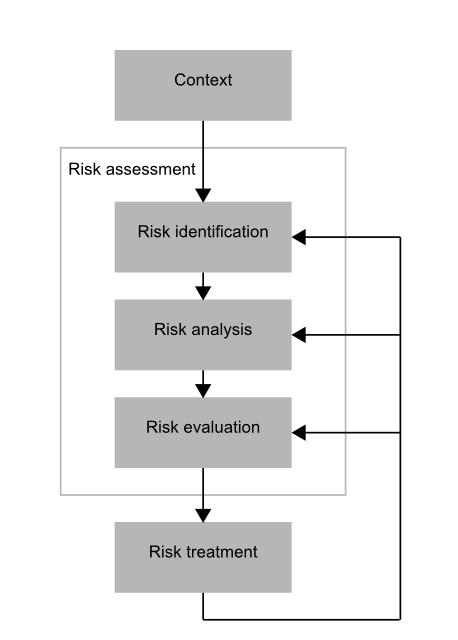
(You may be wondering what the boxes and lines represent. What types of object are they? As this is almost never explained in risk management process diagrams I can't tell you what is typical, but from here on please understand the boxes to be activities (mostly involving thinking) while the arrows show typical directions of inferences from one activity to another.)
A subtle issue with this picture is that the element of decision-making involved is not clearly shown. There's just one box called 'risk treatment' and the arrows backwards that are trying to express some kind of iteration are hard to interpret precisely. The impression is that assessment of 'risks' must be completed before you start to think about what you might do about the 'risks'. Yes, I know there are arrows suggesting some kind of iteration, but this does not change the impression given by the diagram.
These issues can be corrected by showing explicitly that 'risk treatment' involves choosing the best risk responses, and this requires a risk analysis for each option under consideration. In other words, we have to think about what might happen given each risk response. How else could you select the best risk response?
What usually happens in practice is that the initial 'risk assessment' is really an assessment of what might happen if nothing different is done. The course of action is 'do nothing', 'change nothing', or 'continue with existing plans'. Additional assessments of what might happen are done for each alternative course of action (e.g. buy insurance, improve training, drive more slowly). This is not reflected in the usual diagram, but it is reflecting in this next version.
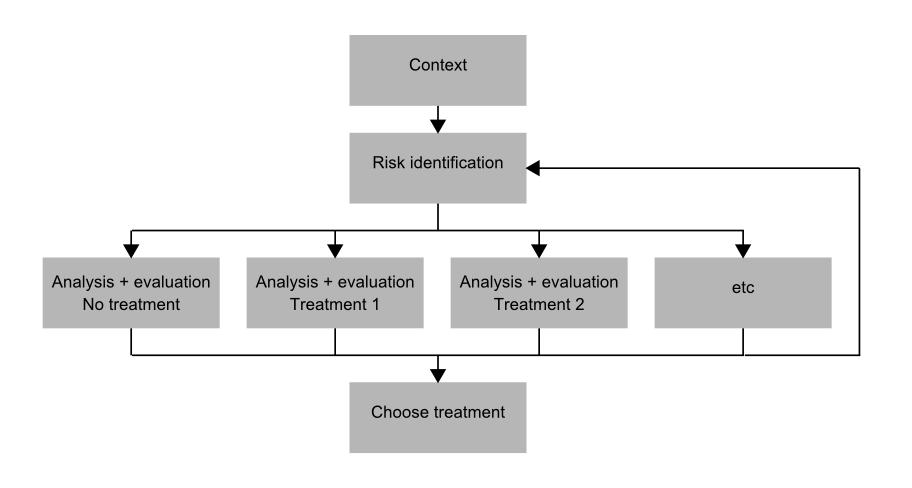
What we are then left with is an improved diagram, but it still has the key problems of Risk Listing:
Separation: Risk Listing looks (and is) something separate from other management. There are no references to other management activities. It's all 'risk' this and 'risk' that. This is one of the things that helps to keep 'risk management' in a separate box in reality as well as on diagrams.
Narrow scope: This diagram shows that the only courses of action considered ('risk treatments') are in some way responses to the 'risks'. In other words, they are things done mainly or solely because of some perceived 'risk'. However, the riskiness of a project or business plan, as examples, results from all the decisions involved, not just those considered to be risk responses. Therefore, this diagram implies a scope much narrower than most people would like. (See Results of a survey on 'project risk management' for details of what people would prefer.)
Fundamental category error: The approach makes the fundamental philosophical mistake of thinking that 'risks' exist as something quite different from uncertainty around our expectations of the future.
Showing risk managed within a generic decision process
Leaving Risk Listing and thinking about generic decision-making moves us towards a diagram that is superficially similar but fundamentally different. The scope here is all decisions, not just decisions about actions seen as responses to 'risks'. This includes the decisions within planning and design.
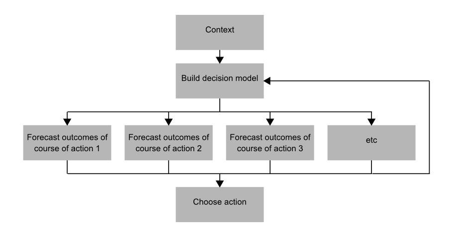
A problem with this diagram is that it gives hardly any attention to the effort needed to devise courses of action. It's a crucial activity and deserves more recognition, like this:
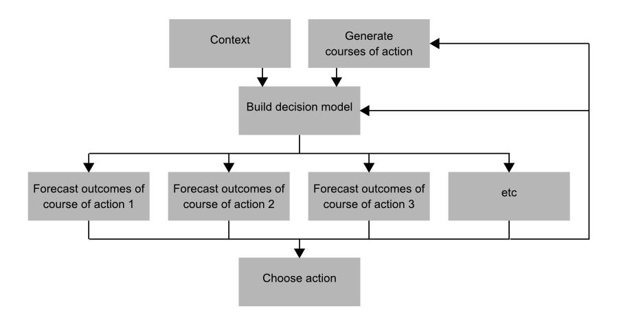
The feedback loops from assessing the possible outcomes of each option go back to the decision model (because improving the decision model is a common result of initial iterations of evaluation) and back to the work to develop alternative courses of action.
A decision model isn't necessarily a fully quantified mathematical model. However, it should capture our relevant knowledge about the world and make it easier to make assessments, even if it is just through conversations guided by a diagram.
In practice it is very common to develop a series of possible courses of action, each trying to be the best so far, using what has been learned from previous assessments.
There remains one rather important problem, which is that it's hard to see anything to do with 'risk' on this diagram. It looks like we just have a generic decision making process. We need to clarify where something special is going on to deal with uncertainty/risk. Most obviously this is usually the probabilistic nature of the assessments, but there is more that can be identified.
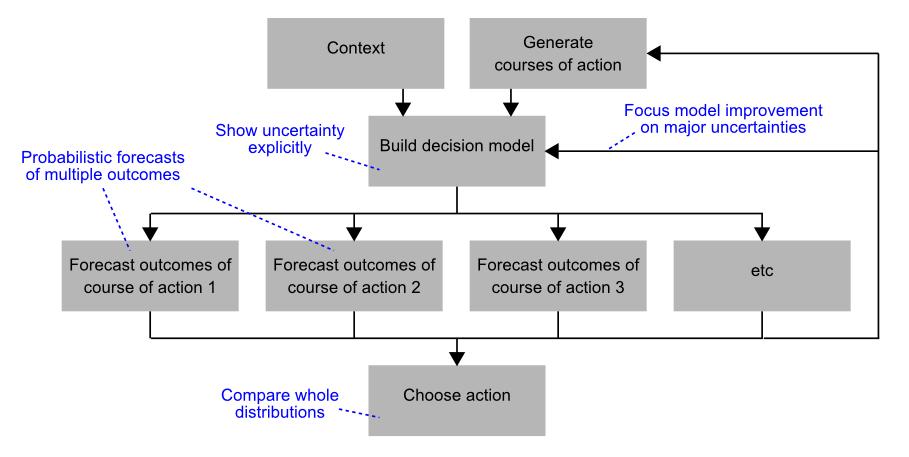
The additions in blue in this last picture are not the only ones that could be included, but I think they are the main ones.
Finally
That's it. I hope you can see that the final result of these sensible changes is a picture much more likely to inspire good working in uncertainty than the original Risk Listing process picture. 'Risk management' appears in the context of a recognizable core management activity (making decisions) and the work needed is much more explicit.
(In fact risk management extends beyond decision making, but this is not shown by the initial risk management process diagram or the improved version above. By looking at all core management activities we can discover other opportunities to improve our performance by dealing with our limited knowledge more skillfully.)
Made in England